Illustrating Hip-Hop Culture: The Making of OKAYPLAYER's Editorial Art Evolution
As a Digital Mercenary, I take on diverse projects for a wide range of clients. Each project's primary goal is to build connections—both with the client and their audience. When Teneille Craig, VP of Brand & Creative at OKAYPLAYER, approached me, they were seeking a signature style for editorial illustrations across their site's various stories. These illustrations needed to be vibrant and engaging while reflecting both the stories being told and their connection to hip-hop culture.
Working with Teneille and Dimas Sanfiorenzo, we crafted OKP's signature style as a Hip-Hop Universe inspired by vintage Marvel and DC illustrations, emphasizing nostalgia that resonated with the brand. Having grown up reading these comic books and studying artists like Erik Larson, Walt Simonson, and Mark Bagley, this was a dream project since my own style draws from the same influences.
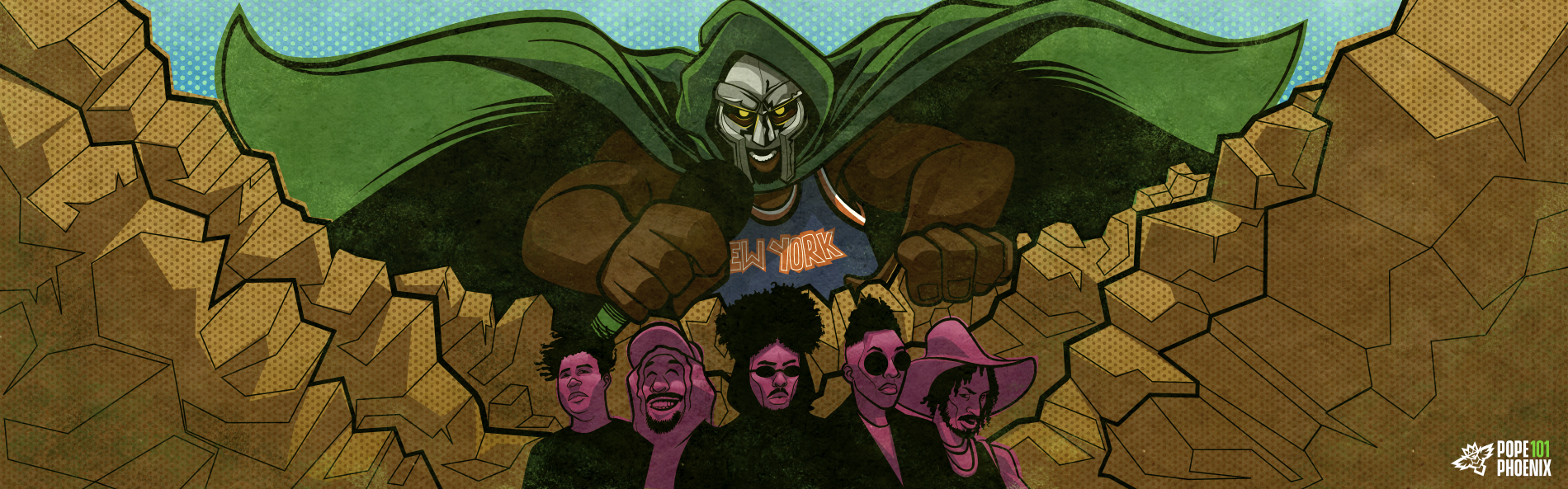
The first project we worked on was a story documenting the influence of MF DOOM and today's landscape of hip-hop. Creating an illustration of DOOM was especially exciting because it meant diving into decades of reference material from Marvel's illustrious archive. The early Jack Kirby covers typically showed DOOM towering over his contemporaries—a perfect parallel for this piece.
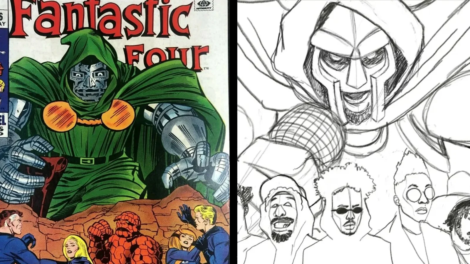
After defining my direction for this piece, I needed to figure out how to get there. This meant exploring multiple concept versions to capture the right tone and structure. I believe every project should start with a range of concepts—from obvious to outlandish—to find that "just right" baby bear, sweet spot. What works perfectly for one project might not suit another. Sometimes the best choice is a simple editorial portrait, while other times the project calls for something more abstract. Being open to where the project leads is essential in this kind of creative work. After seeing the concepts, we realized we needed to add more half-tone effects, off set registration of colors, and weathered textured to solidify the vintage comic book look we were aiming for.
The final result created a unique look for OKAYPLAYER that was distinctly their own. It also advanced my skills in establishing a creative editorial illustration style that would help define my career. During my two-year collaboration with this team, the style grew, solidified, and evolved. My use of lighting, the placement and intensity of halftone effects, and even the line weights shifted to match each story's needs—all while staying within the established style guidelines.


This is crucial when creating a style guide for any project. The guide needs clear boundaries while allowing enough flexibility to occasionally push—or even break—those boundaries when appropriate. Too much flexibility prevents a consistent visual language from forming, resulting in merely a collection of loosely connected images. If you go the other direction, an overly rigid guidelines may align the work but risk making everything look identical, leading to boring visual landscape.
While developing the visual elements, I had to carefully consider both aesthetics and functionality. OKP's articles used a very wide format at the time—1900x600 pixels. This custom dimension presented unique challenges, as the homepage thumbnail required a centered 1200x600 image. This format made some stories easier to illustrate but complicated others, since all key elements had to work both in the wide format and when centered for thumbnails.
For these illustrations, I centered the main focus and positioned secondary storytelling elements along the sides. The De La vs Tribe piece perfectly demonstrates this approach—Posdnuos and Q-Tip battle it out in the center while De La Soul flowers burn in Tribe flames along the edges. The composition guides viewers' eyes to the central conflict through yellow tones, then draws their attention outward to the flaming flowers in the stark black.

By the time this piece was released, I had created between 40-50 illustrations for OKP. The brand's style was evolving—phasing out the halftone effects in favor of various textures while maintaining the comic book aesthetic. This shift changed very gradually that it was hardly noticed and the transition worked.


When this project ended, I felt proud of the style that defined this era of OKAYPLAYER. I had created more than 100 illustrations spanning general stories, their Behind the Beat anthology, and an extensive Zodiac project that took months to complete. The style even translated successfully into animations for social media, telling stories about Nipsey Hussle and Tupac. The illustration guidelines I developed for OKP proved robust and flexible across multiple uses, defining not only the brand but also showcasing my ability to tell compelling visual stories.
Key Summary
Developed a signature comic book-inspired illustration style for OKAYPLAYER's editorial content, blending vintage Marvel/DC aesthetics with hip-hop culture
Created over 100 illustrations spanning general stories, Behind the Beat anthology, and a Zodiac project
Style evolved from heavy use of half-tone effects to varied textures while maintaining comic book aesthetics
Designed illustrations for wide-format requirements (1900x600) with centered compositions for homepage thumbnails
Established flexible yet consistent visual guidelines that allowed for creative evolution while maintaining brand identity
Successfully expanded the style into animations for social media content about notable artists like Nipsey Hussle and Tupac
If you would like to see more illustrations I created for OKAYPLAYER you can see the entire archive of my work on their site:
OKAYPLAYER/POPE PHOENIX